This project is a case study for the Google UX Design Professional Certificate course. It highlights the design process and decisions made, wireframes, mockups and High-fidelity prototypes in Figma along with explanations of the user research and testing that informed them.
Project Overview
HealthyEats was a responsive website and mobile application design to help users learn how to make healthier eating choices and develop good eating habits.
My Contributions
My role was to identify the customers who are going to use the app, conducting interviews, paper and digital wireframing. Low and high fidelity prototyping, conducting usability studies, accounting for accessibility, and finalize the design of the website and mobile application ready for the developer. The duration of the project was December 2022 to January 2023.we
Problem Statement
The problem is that many people struggle with maintaining a healthy diet due to a lack of knowledge about what constitutes a healthy meal, as well as a lack of time and resources to plan and prepare healthy meals. This can lead to poor health outcomes such as obesity, diabetes, and heart disease.
Goals
The goal of this website is to teach people how to eat healthy by providing them with easy-to-follow information and resources on how to plan and prepare healthy meals, as well as the benefits of a healthy diet. This will help users make informed decisions about their food choices and ultimately improve their overall health and well-being.
Design Process
The first step was to conduct user research to understand the needs of the target audience and the current challenges they face when trying to eat healthy food. This include a survey and competitor analysis.
Design Considerations
The website and mobile application designed for social good aim to educate and empower individuals to make healthier food choices. The main goal of this project was to improve the overall health and well-being of users by providing them with the information and resources they need to make healthier food choices.
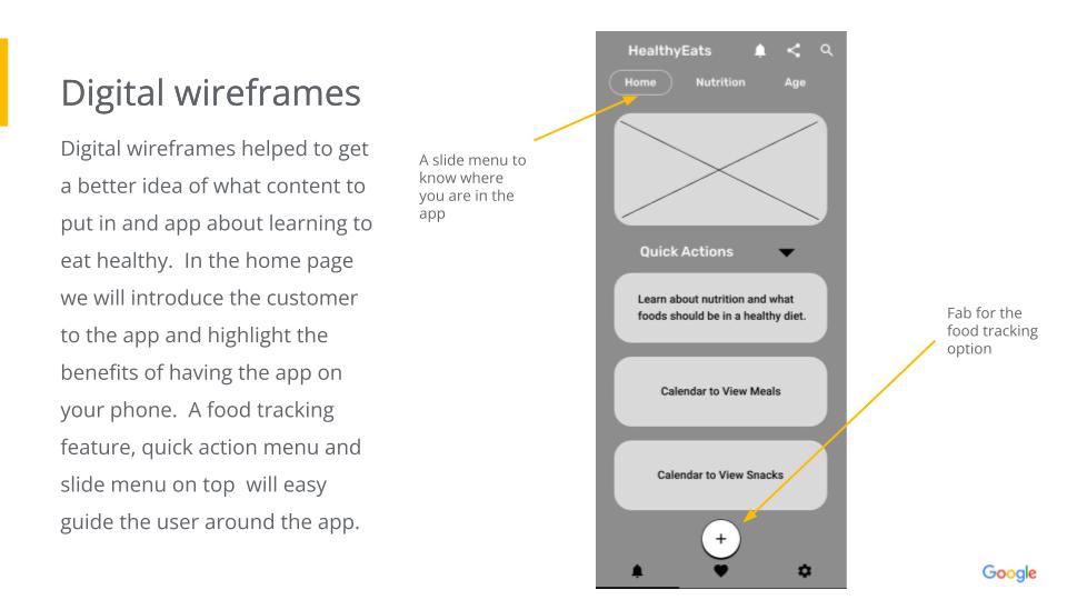
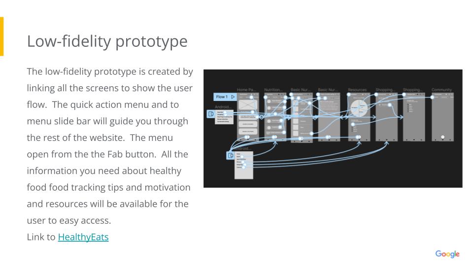
Once the research was completed, the next step was to create wireframes and prototypes of the website and mobile application’s layout and navigation. This involved deciding on the structure and organization of the content, as well as designing the user interface.
Usability study findings.
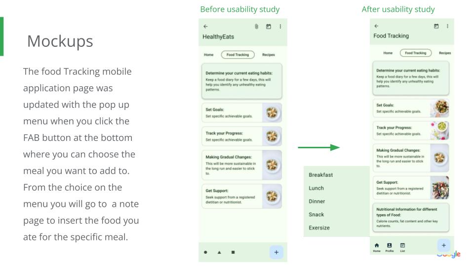
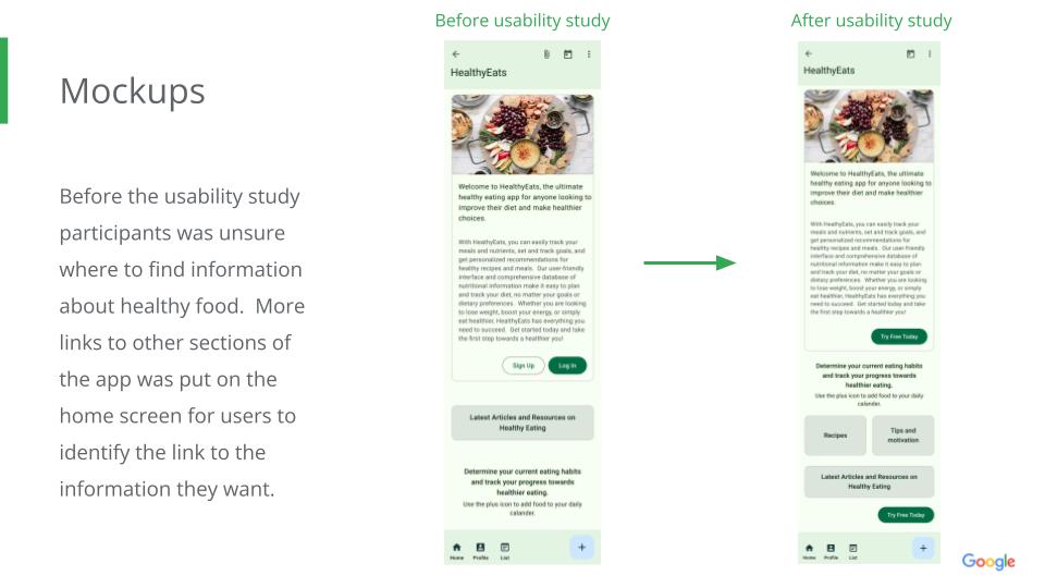
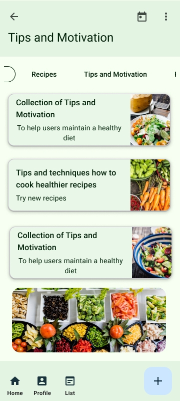
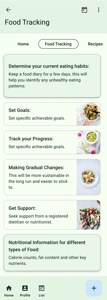
Most users found it difficult to navigate the mobile application.
Users had trouble finding the food tracking feature.
More links to different sections off the app was put on the home page to help with navigation in the app.
The food tracking feature can now be reach through the FAB button.
Users found the health and nutrition information provided on other websites to sometimes be inaccurate and outdated. It is important to keep information updated.
Most users had trouble finding the information they are looking for due to confusing layout and lack of labeling. More labels and navigation buttons was put in.
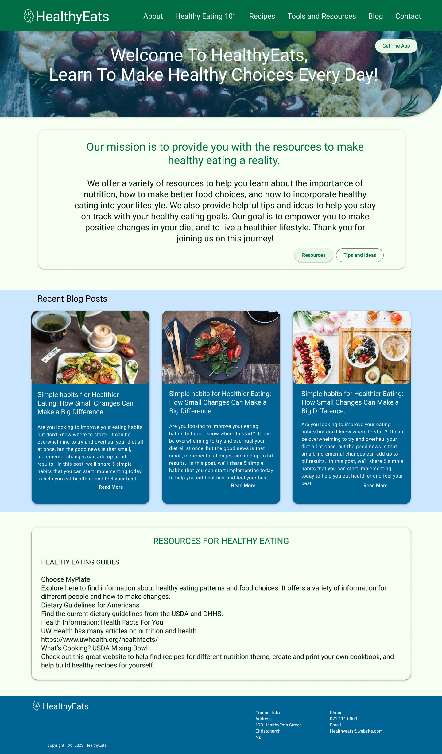
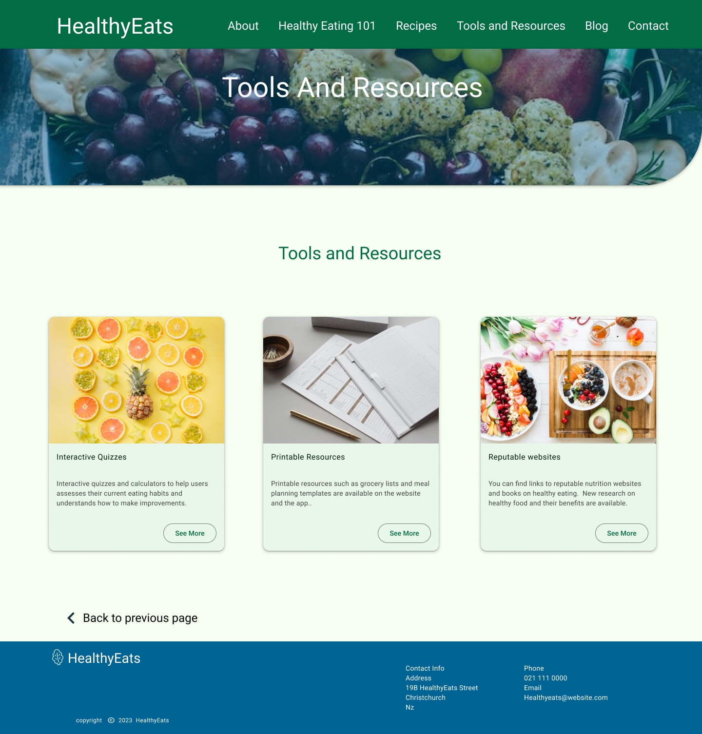
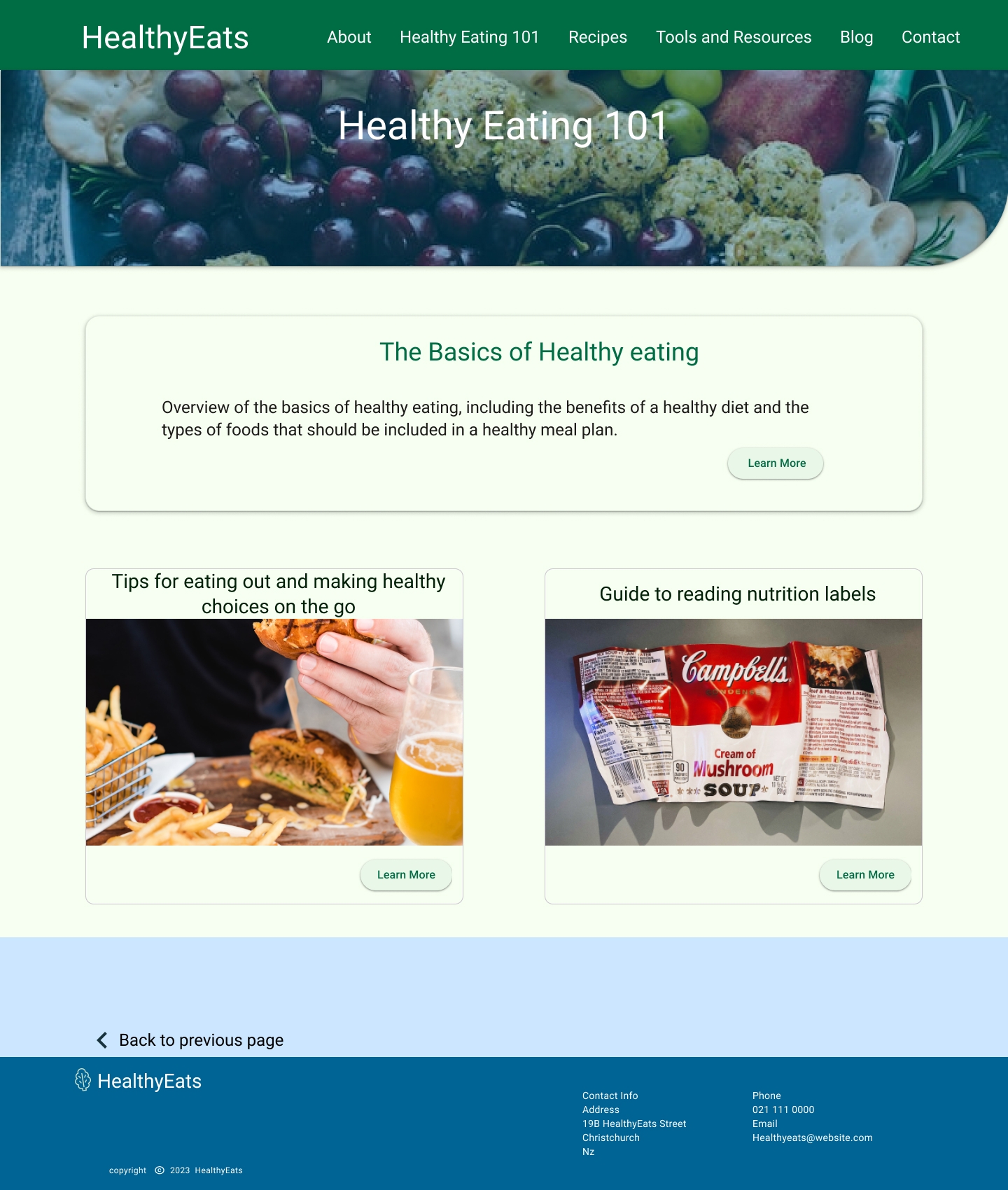
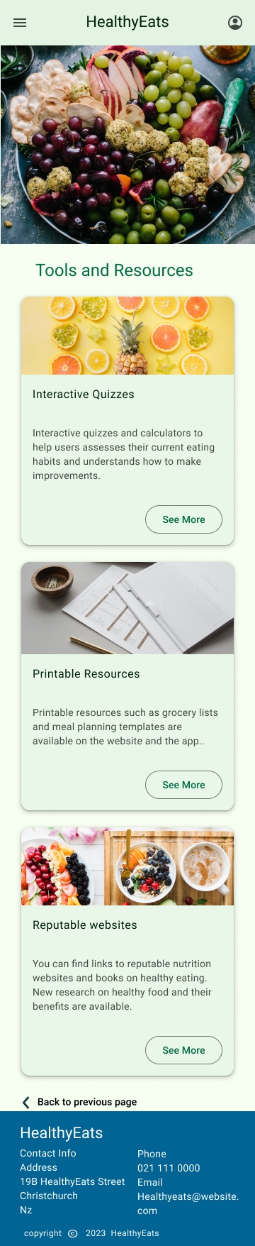
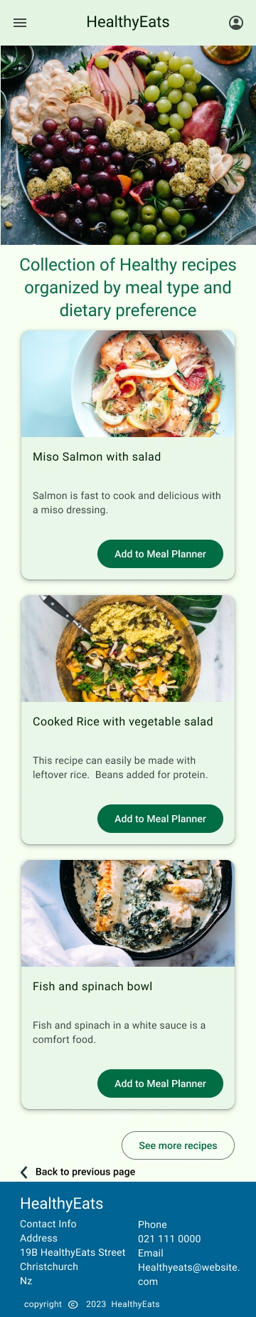
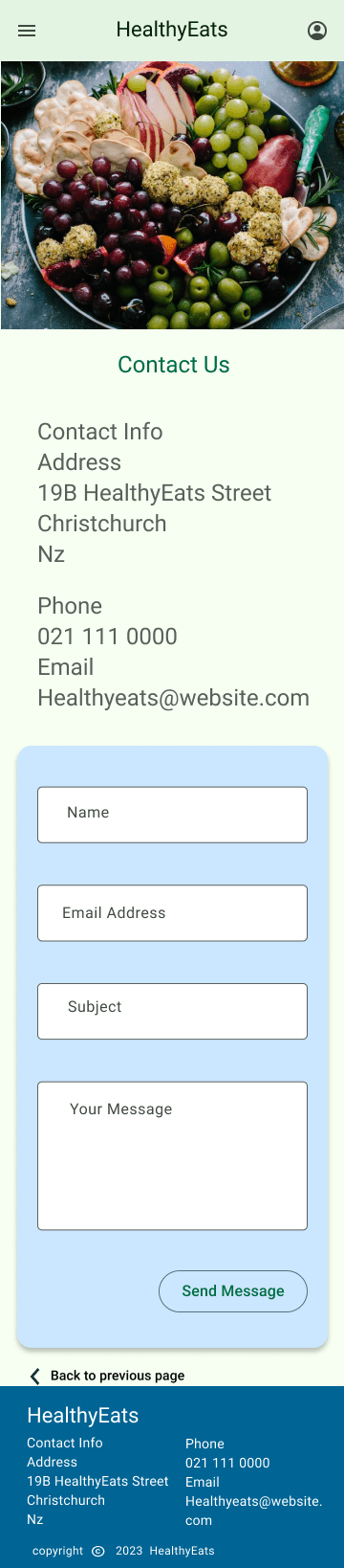
High-fidelity Prototype
Lorem ipsum dolor sit amet, consectetur adipiscing elit, sed do eiusmod tempor incididunt ut labore et dolore magna aliqua. Ut enim ad minim veniam, quis nostrud.
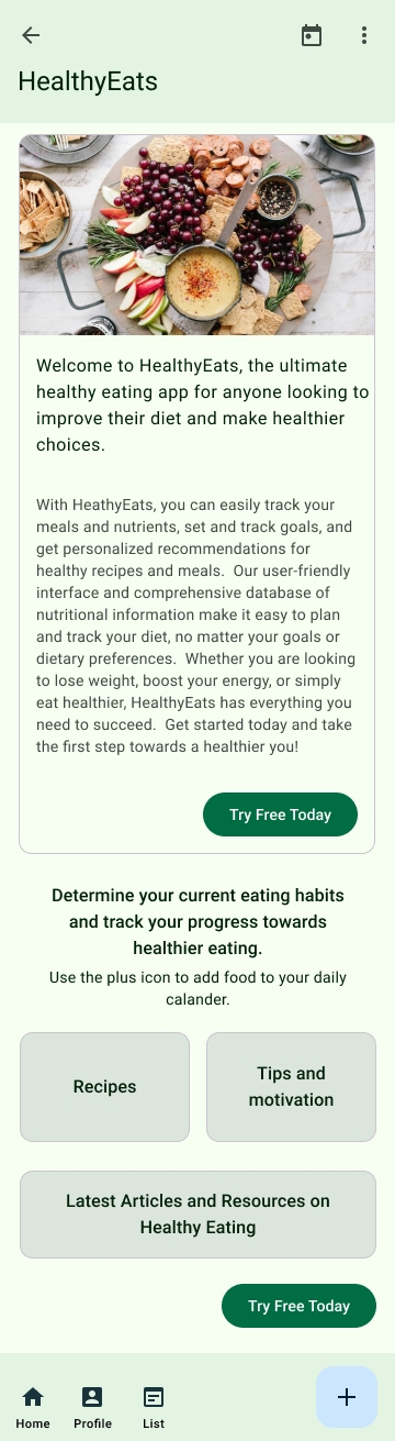
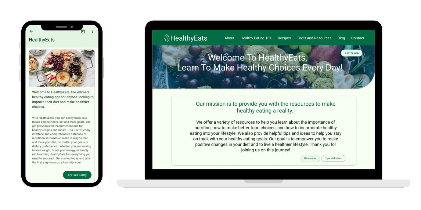
Final Designs
Final designs of the responsive website with screens for a desktop computer and mobile phone. After development the website and mobile application would be continuously monitored for their impact on users, to see if the project was successful in achieving its goal of improving the overall health and well-being of users by providing them with the information and resources they need to make healthier food choices.
 – Figma 8_01_2023 4_37_28 pm")