This project is a case study for the Google UX Design Professional Certificate course. It highlights the design process and decisions made, wireframes, mockups and High-fidelity prototypes in Figma along with explanations of the user research and testing that informed them.
Project Overview
This project is a mobile application UX research study for a bakery in a neighborhood with variety of possible customers. The need for a mobile application for faster service was identified that would allow customers to order products for pick up at a chosen time.
My Contributions
My role was to identify the customer who is going to use the app, conducting interviews, paper and digital wireframing. Low and high fidelity prototyping, conducting usability studies, accounting for accessibility, and finalize the mobile application design ready for the developer. The duration of the project was August 2022 to October 2022.
Problem Statement
The bakery currently experiences long wait times for customers during peak hours, leading to dissatisfaction and lost business. Additionally, customers have reported difficulty navigating the current ordering system, causing further delays.
Goals
The objective was to design a mobile application for a bakery that improves the checkout speed and service when ordering through the app. The mobile app will streamline the ordering process by allowing customers to place their orders in advance, view menu items and process, and pay for their orders directly through the app.
Design Process
The first steps was user research to understand the needs and target audience and how they would use the bakery app. This include user interviews and a competitor analysis.
Design Considerations
The design considerations was a user-friendly interface, fast and efficient checkout, clear and concise information presentation and integration with existing bakery systems.
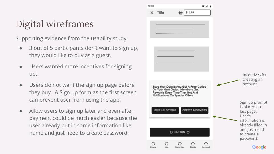
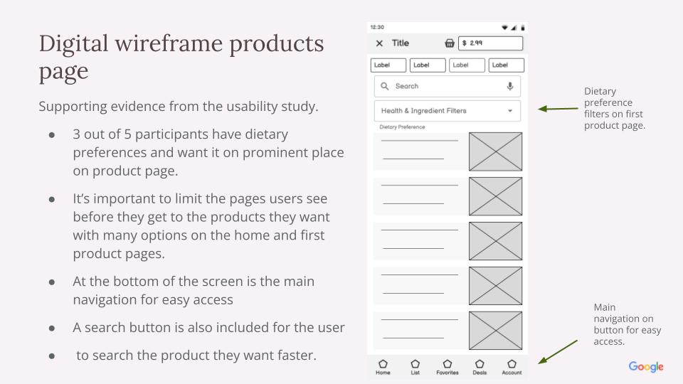
Usability study findings (round 1);
Most users don’t want to sign up before they buy.
Most users want special diet options on product page.
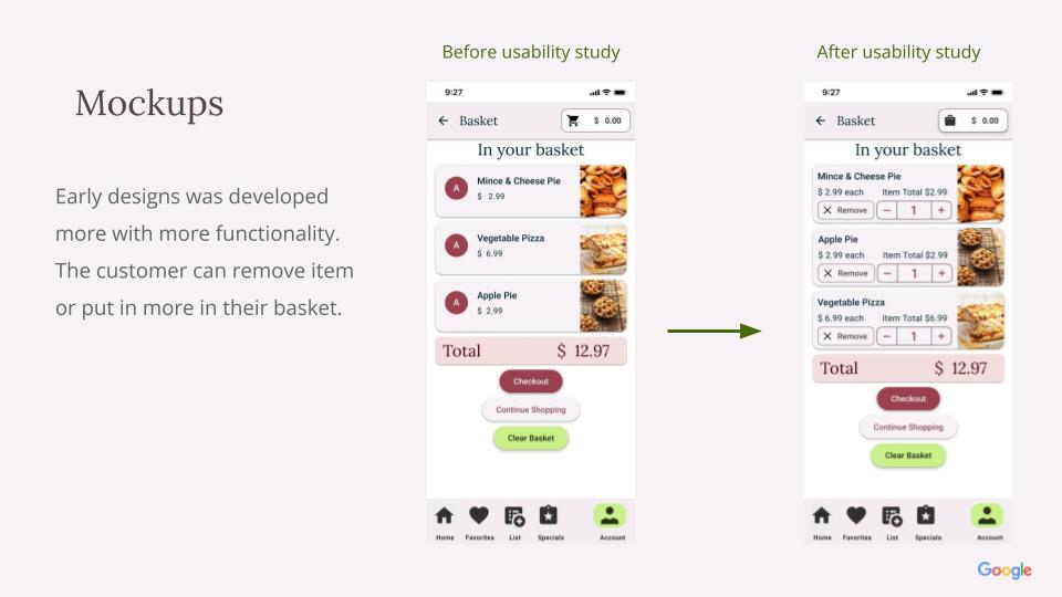
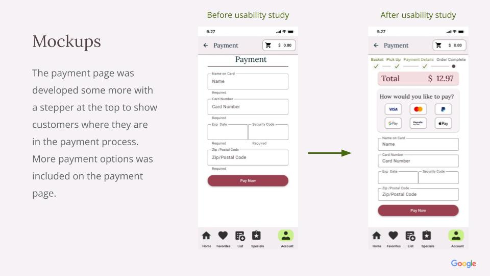
Usability study findings (round 2):
Most users want a add to basket button on the group product page.
Users want a reminder of the payment amount on the payment page and more payment options.
More users prefer browse instead of search.
High-fidelity Prototype
Not all the screens was developed, just the main user flow.
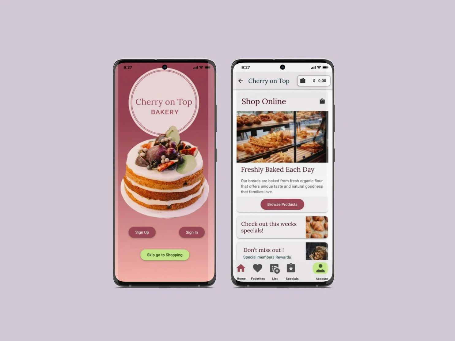
Final Designs
A few of the screens from the final design. The expected outcome was to improve satisfaction, reduce wait times, increased sales and revenue and positive impact on the overall experience of the bakery.